Column graph (histogram)
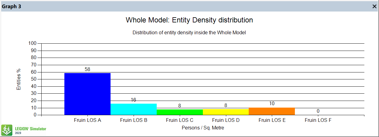
The X axis represents a discrete number of ‘buckets’ defined within ranges; the Y axis shows the percentage contribution of each category to the total number of Entities included in the analysis.
The graph refreshes at each time-step, obtaining values for all Entities, mapping them onto the range’s colours and creating bars that are proportional to the percentage calculated for each bucket. The values in this kind of graph must relate to an Entity experience metric (speed, density, etc.). If a colour range is selected then the categories are updated dynamically by the software.